Sunday, November 29, 2009

Idyllic retreat of the outdoor garden

Sit back, relax, and feel the essence of nature in a place that is entirely in tune with your surroundings, a place that responds to your emotions and sense of well being. Feel the sun, the rain and the breeze. Escape the chaotic urban life with your ultimate green sanctuary. Meditative water feature, rock composition, and perfected courtyards continue to inspire design solutions today.

A Zen garden. The act of raking the gravel into a pattern recalling waves or rippling water has an aesthetic function. Zen priests practice this raking also to help them focus their concentration. Achieving perfection of lines is not easy. Rakes are according to the patterns of ridges as desired and limited to some of the stone objects situated within the gravel area. Nonetheless often the patterns are not static. Developing variations in patterns is a creative and inspiring challenge.


I was looking for some water feature ideas for our outdoor wet kitchen. These floating effect stepping stones look perfect for our space.

This graphic above shows more or less like our side walkway from front yard to the outdoor kitchen at the back.

Get out of ‘boxy’ look, says famous Indonesian designer

Article extracted from "The Star", Monday, November 30th, 2009.

KUALA LUMPUR: An advice to local developers and home decorators - get out of the cliched and outdated “boxy” look.

A prominent landscape designer urged Malaysian designers to put natural beauty and art back into its garden designs and return to her tropical forest roots. Made Wijaya, a landscape designer, said local designers should look towards the rich local culture like those in Kelantan and Terengganu for inspiration. “Hotels, the urban environment and now even houses have started to look more like microwave ovens,” he said at a talk during The Star Property Fair 2009 here yesterday.

Sharing ideas: Wijaya showing Star Publications marketing services general manager Iris Tan and Kenny Heights head of marketing Jennifer Chow the design concept of Kenny Heights.
Wijaya challenged the housing industry to break out of its decades-old fascination with landscape designs that “looked man-made and machine-made.”

“Some Bali exports have become soulless,’’said Wijaya.

He said most external and some indoor designs tended to have the “new Asia zen garden design kit” comprising timber grills, U-spouts, leaking black walls and stepping Bali stones. “Someone told me that by 2050, Asians may have to look to Europe for cultural architecture if things go on (like this),” he said in jest.

He noted however that making gardens and patios more natural looking did not mean that it would lose the modern and contemporary touch either. ID Benchmark Sdn Bhd art director Valerie Choi said one of the most important things in making a room appear larger was the choice in furnishing.

“Select furniture with an open concept such as wide-legged chairs and coffee tables,” Choi said. One should also be aware of the traffic flow in the room by placing the largest piece of furniture and arranging other smaller furniture around it.

These tips, she said, should be utilised by small space owners particularly city folks who live in high-rise buildings with confined space. She said owners should also stick to the principle of “less is more.”

“Keep your apartment clean and simple. Clutter free is always stress free.”
She also said the easiest trick of the trade in creating a larger space - by using mirrors.

Thursday, November 26, 2009

Artistic furniture

It’s a bit loopy, but the bent-wood ‘Artistic 4 Chaise’ fits the curves of your body within its unusual design. Handmade from British Oak, this lounger will certainly be a conversation piece in any home or outdoor area.

Pod lounge chair gives you the secluded feeling of being included in a protective circular shell. It is made up of lightweight, structural foam with a marine grade vinyl exterior from WeatherTex. It is both durable and seemingly luxurious.
This is a Teenage Furniture concept design submitted by Roberta Rammê from Brazil for an international design competition, and she named it “wave chaise”.

The Maze Bookcase by Woodloops offers an entertaining, eco-friendly way to store and display books and décor. The designer says that Woodloops furniture, made of FSC-certified wood, “covey our original views to common behaviors, weaving known circumstances into new and curious concepts”.

Birdy chair is a great addition to any modern interior. It’s handmade of wood, liana and leather. The dried liana is made flexible and easy to handle by hot water steam and wrapped on the frame made of wood. When the liana is dried again it is very strong and hard to break.

Benches don’t have to be bland and boring. This unusual, artistic design by Yvonne Fehling and Jennie Peiz features a long and narrow stretch of wood that seems to have swallowed a number of wooden chairs. The resulting composition allows face-to-face conversation as well as isolation from the rest of the people seated on the bench, and the fact that the wood grain is aligned on every piece gives it a cohesive look that tones down a bit of the chaos.

If you are interested in ultra-modern, minimalist and/or industrial design, the Soft Pipe Lounge is a piece of furniture worth a close look. The seat was designed by Samanta Snidaro and Andrea Fino and made from large iron pipes and has a soft, but not exactly plush, leather cover over the actual seat area of the chaise.

Designer Mathias Koehler has come up this thing, the "Rocking Wheel Chair" that features an overhead light for reading. It also features scary as hell styling and comes complete with a sense that it will tear your heart out and eat it before it's done beating.

With serpentine legs that resemble nothing so much as octopus tentacles, the ‘r.n.i.’ series of tables by Chul An Kwak is actually inspired by images of running horses. Sculpted from wood, these designs offer the same sort of flat surface you’d see in a conventional table but with legs that seem kinetic and alive.

This Alien-inspired table is supported by a sculpture made almost entirely from recycled materials like spoons, wrenches and car parts. The maker of this unique piece also create tables and chairs inspired by Star Wars. (my husband gonna looove this :-D)

The Gravity Lounger by Varier Furniture has an unconventional design, but it certainly looks comfortable. The makers claim that sitting in this chair is “probably the closest you’ll ever get to zero gravity”, reclining to the point where you feel almost weightless. It can also be positioned upright to work at a desk.

The Tentacle Bench by Carpenter’s Wood Gallery seems to have a mind of its own, with curvilinear wooden slats collapsing into a pile to one side of the bench and then traveling up the wall like ivy.

Mexican house by Agraz Arquitectos


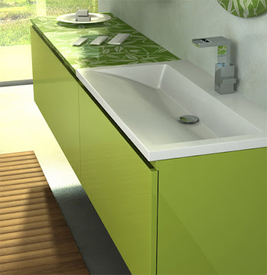
Stylish bathroom by Duebi Italia

Wednesday, November 25, 2009

Philippe Starck High Backrest Armchair


Designer Philippe Starck has unveiled his new creation of High Backrest Armchair at the Milan furniture fair. Manufactured by the Italian company, Driade, the chair are designed for both indoor and outdoor use. Intended to cocoon the user and allow them to curl up in a variety of positions, the armchair is an interesting evolution of Starck’s Oscar Bon and Lago chairs that he has previously designed for Driade.

How to achieve the Modern Minimalist Clutter-free look?

Although modern interiors are cold and minimalist, its contemporary interiors are comfortable and soothing with clutter free and airy, spacious look and feel.

To achieve the look of these minimalist homes, it's important to stick to some basic rules.
Simplicity and clutter free are the basic rules. Subtle sophistication, texture and clean lines help to define this style of decorating. Focus on color, space, and simplicity, your home will look sleek, fresh and welcoming.

You do have to be a person who likes simplicity and clutter free to go with this minimalist look. If you are the kind who struggles to stay tidy (me!), likes you stuff everywhere around you, knick knacks and likes to display your collectibles around your house, this style will be a disaster for you. The interior design of the minimalist home should have fewer divisions to create a wide open space or an illusion of wide open space.

However much I like the look of a minimalist style, I don’t think its suitable with me – who has so many stuffs around my house. To get the same look I have to modify the design a bit, and create more organized storage space to keep all my stuff, at least within reach. The trick is to look- really tidy, clean and totally clutter-free and wallah, you get yourself not only a relaxing, soothing and tranquil, but also a super, modern, cutting-edge look.

Tips to a minimalist – clutter – free house.
  • Neutral colors, black, grey and white are the main colors in contemporary style interiors. White is the ultimate color for a minimalist interior design look. White should form the basis of your minimalist decorating scheme – for smooth walls, floor and furniture. For a modern, softer alternative to white, try neutral colors, or colors found in nature – choose pale beige, taupe, stone or even green.
  • Your furniture should be classy-looking but streamlined and modern, rather than decorative or traditional in style.
  • Choose plain furniture in natural woods and leather, or go for bright colors, and ultra-modern chrome, glass and stainless steel.
  • Glossy textures and straight lines are a great look for the minimalist interior design style.
  • Accessories are not a major part of the minimalist interior design look – the whole idea is to clear out the clutter, and have as little ‘stuff’ as possible on show.
  • Storage is, of course, a very big factor. Everyone does have stuff – and uses stuff all the time – so to keep this look neat and tidy (just the way it should be!) invest in plenty of roomy storage (easily accessible!) to keep it all hidden away.